• Blogging
  • Technology News
  • How To
  • Webmaster Tips

The Web Files

Web site promotion and marketing info, Helpful Tips, Latest Gadgets, News and Webdesign Services

  • Home
  • Blog
  • Archives
  • Links
  • About
  • Contact

You are here: Home / Archives for Webmaster Tips / Web Design

using principles of design for web desgin

September 21, 2009 by Tricia

The principles of web design are applicable in every field of designing whether it is for web design or any other form of designing. They lay more emphasis on putting the design elements in an effective manner. The principles help you to achieve the results that area more pleasing.

* Balance may be defined as the accurate placement of the light and the heavy elements on the page. The balance principle will help us to achieve the target which helps us to design a better layout. It might b be described as the actual interpretation of the gravity in the design or it is the distribution of the elements in the design. The balance designs can be controlled in three main ways viz: Symmetrical balance means placing the elements in an even fashion in case you are placing heavy elements on the left side then similarly you would place the heavier elements on the right hand side. The balance designs can be controlled in 3 main ways : Symmetrical balance means placing the elements in an even fashion in case you are placing heavy elements on the left side then similarly you would place the heavier elements on the right hand side. The next criteria that you need to consider is the off balance style, in this form the design is totally unbalance. In case your website has content which is intending peoples to think then it is important to note that you can go in for the discordant or the off balance style.

* Contrast: Contrast might be defined as the difference between the similar element, further it’s not applicable only to color consider that there are several lines and one of the line is longer that other lines,then there is presence of contrast in this scenario. SO it’s very important to note that in case you are applying contrast in designs then you do think beyond color. You can use contrast by showing differences in the font size and font family. Headlines are more contrasting in nature than the surrounding text. Links also provide contrast, like the underlining and color of the link content provides room for contrast.

* Emphasis is the focal point which is provided to some content. A good web designer will determine the hierarchy to the content. It is a way of determining the elements which are more important than the others. Emphasis can be implemented by the semantic mark up, fonts and the color in the design.

* Rhythm: Rhythm is also defined as repetition. Rhythm brings in internal consistency to the website. Repetition is a good way to attract people’s attention and instigates. Probably you can repeat the headlines 3 or 4 times to generate greater emphasis. It can be also implemented by repeating the text in HTML,inserting images a several times,repeating the navigation elements in all pages.

* Unity: Unity may be defined as proximity or in other words it is the principle of keeping the similar elements together and keeping the different elements apart. Unity can be achieved through putting in your layout.


Filed Under: Web Design Tagged With: SEO, Web, Web Design, web design services

Survey Reveals What People Hate About Websites

August 19, 2009 by Tricia

What makes you want to click out of a website before you read the first sentence? For me, it is cheesy music with no “off” button.

Signs of Webmaster Newbies

All of us have been “newbies” at one point in our web-mastering lives.To make what we thought were impressive sites, we spent hours searching the free JavaScript sites, dhtml sites and so on for copy-and-paste scripts.

You can easily spot a first timer’s website because of the smorgasbord of java-scripts, animations and other copy-and-paste components. The problem is, this makes a site look amateur.

Creating an Amateur Image

You might have a brick and mortar business that’s been around for the last decade, with tons of satisfied customers.On the net, however, your visitors do not know who you are.A professional online image will create trust.  When designing your website, here are some things to avoid so that your business does not look amateur or like a fly-by-night operation:

  • Dark, heavy backgrounds with hard-to-read fonts – For a business website, it’s best to use a plain white background and black text so that your visitors can read it easily. Some first timers are tempted to have patterned or colorful backgrounds, with different text colors. Not only does it make your text hard to read, but if you are including pictures of products, it is hard to make them blend in with the background.
  • Pages that are larger than the browser screen – There’s nothing more irritating that trying to read a web page that scrolls across the screen. Generally, web users use 1024 x 768 as their desktop resolution. Try to remain within those confines.
  • Sound effects – Everyone has different tastes when it comes to music, but even if you discovered music that appeals to every single person alive, don’t make it automatically load on your site. With a music site, there are scripts that will allow the user to click “play” at his or her option. This goes with audio advertisements or other background sound effects — provide a way to pause the sound or shut it off.
  • “Cool” effects – About 8 or 9 years ago, it was real “cool” to have a flash presentation on the index page. Everyone was doing this. This does not establish your online reputation. Flash introductions take forever to create and many of them are just downright stupid. These intros can take a long time to load and most people will not wait around to view them. Page fading effects, animated images and scrolling text are things that beginners seem to think are cool. When I first started out, I was guilty of adding these things because I thought it made me look like I knew what I was doing. However, the harsh reality is that these effects are a wate of time and a turnoff. I’ve seen some sites, designed by supposed design specialists, where the links scroll by really fast and you have to “aim and shoot” just to be able to click a link. Don’t bother adding these effects. People are visiting your site for information or products, not a bunch of movement that’ll give them a headache.
  • No clear navigation scheme – Many people enter a website by the interior pages, not at the home page. You should give your visitors a way to easily click through your site. Menus that are positioned on either the left or the top of the web page are the most popular and will be most familiar for your visitors. The key is that no matter where you place your menu, make sure that it is consistent throughout your site. A missing or confusing navigation menu is a sign of amateur web design.
  • No search feature – Particularly if you have a large product line that you are selling or if you have a content rich site, always include a search box to help your visitors. If you do not know how to do this, there are quality free services such as Google search.  This makes your site “user friendly” and shows that you care about your visitor’s experience on your site.
  • “Secret” prices – If you’re selling products, include the price. Don’t force your potential customer to go through the shopping cart process just to find out the price — many are turned off by this and will not do it in the first place.
  • Policies – An amateur site will not include privacy policies, terms of use and, when selling products or services, returns and shipping policies. You should also provide contact information, particularly if you are selling products or services.
  • Under construction pages – “Under construction” or “coming soon” pages are a surefire way to announce that you’re an amateur. If you are not done with a page yet, do not link to it. Add a link to your menu or sitemap at such time as the page is completed.
  • No online shopping cart – If you are selling a product, provide a way for people to purchase your product online. When people are looking to buy something online, they want to be able to buy it immediately. Chances are, they do not want to send you a fax with their credit card information or mail in a check or money order. If you don’t have a merchant account, take a look at PayPal or, if y ou are selling digital products, consider services like Clickbank.There are free shopping carts available for people who already have a merchant account, such as Mals-e.com, which also gives you the ability to offer an affiliate program.

What’s Your Top Gripe?

Newbie or pro, you can voice your opinion about what makes a stinking website at the NotGuru’s survey about poor website design.If you’re looking for giveaways, software and tips to help your fledgling online business, the Not Guru blog delivers plenty of resources every day.  Take the site design survey today and feel free to submit your comments – the results are quite interesting.

Filed Under: Web Design Tagged With: javascript, newbies, sound, survey, Web Design, website design

“I need a new design” contest – Enter Now

July 20, 2007 by Tricia

Are you tired of the look of your web site? Ready for a change?

Why not enter the “I need a new design” contest that’s being held by lifeBLUE Media.

LifeBLUE specializes in web design, graphic design, SEO, Internet marketing, application development, and web hosting. Visit the site and take a look at their portfolio. They are featuring some very nice web designs that they’ve done for past clients. You’ll be in good hands if you win the contest.

It’s easy to enter the I need a new design contest. Simply visit the LifeBlUE.com website and fill out the contest entry form. Unfortunately this contest is only open to US residents. Otherwise I’d probably enter this plain Jane site myself.

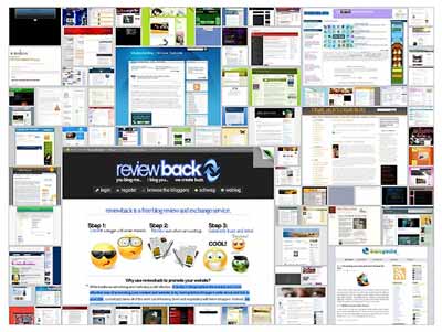
Once you enter the contest you can tell your friends, family and site visitors about the contest and ask them to vote for your site. As you’ll see by visiting the contest link above the site that’s in the lead is shown as a larger image in the collage of sites that have entered.

designcontest.jpg

The contest began and July 9th and submissions and votes will be collected until August 8th, 2007. There’s still plenty of time to take the lead and win a professionally designed web design.

The winner will receive a custom design that will be in both graphical format as well as html format. The design will be created by LifeBLUE’s experienced design team.

The winner will of course have the ability to provide feedback on the design and information about the goal and direction of the site so that the team will be able to create a suitable design that will take your site well into the future.

There are actually two ways to win this contest as two winners will be selected.

One way is to simply submit your site as described above and then to garner votes. The person who has the most votes, and likely the worst current design as determined by their voting friends, family and site visitors will win a free web design.

The second way to enter this contest is to enter the random draw. Write up a blog post and use the following anchor text to link to the main index page of LifeBLUE Media:

Link url – http://www.lifeblue.com/web_design_contest/

Text: web design, web designers, website design, web design company

I presume that the people at LifeBLUE will be keeping track of incoming links with any of those link phrases and that they will add those sites to the random draw.

Why are you still here?

Get going! Enter the contest! A free web design would be fantastic wouldn’t it?

Filed Under: Blogging, Contest, Great Products and Sites, Great Sites, Services, Site Promotion, Web Design, Webmaster Tips, Wordpress Themes Tagged With: blog, blog post, clients, Contest, contest entry, design, enter contest, free web design, graphic design, graphic website, html website, LifeBlue, LifeBlue media, portfolio, random draw, submit site, two winners, vote, vote for worst site, web design contest, worst site

Page two is a mess!

July 16, 2007 by Tricia

I’m trying out a couple of new plugins and for some reason it’s messed up page two. Please excuse the mess.

I’m actually creating this new post in the hope that by adding something to my database it will fix the problem. Who knows … might be worth a try!

Edit – it didn’t seem to help. Oh dear.

Filed Under: Blogging, Web Design, Wordpress Tagged With: database, messed up page, page two, plugins, post, posting

Connect with Us

  • Facebook
  • Flickr
  • Instagram
  • Pinterest
  • RSS
  • Twitter

Categories


Eavestrough Cleaning Toronto

Recent Posts

  • Top Social Media Automation Tools Designed For Marketers
  • Social Selling: The Right Way to Sell Through Social Media
  • When in Doubt Turn to SEO Consulting
  • Considering using Guest Bloggers
  • Can you make money blogging? Yep
  • The World Of Blogging
  • Internet Marketing And Permission-Based Email Marketing

Recent Comments

  • Locked out my own sites by Bad Behavior plugin — The Web Files on The War on Comment Spam
  • AspDotNetStorefront E-commerce shopping cart — The Web Files on What Are The Best Ways To Make Money Using A Blog?
  • I changed my do follow plugin to Lucia’s Linky Love — Tricia's Musings on I’m not against website urls – I’m against comment spam
  • diagnosing comon windows errors on It’s important to backup your data regularly
  • Parol on Social Selling: The Right Way to Sell Through Social Media

Shopping

Gifts, Gadgets, computers and More! At our Amazon store.

Text Link Ads

Site Stats


Meta

  • Log in
  • Entries feed
  • Comments feed
  • WordPress.org

Archives

Blogroll

  • The Career Strategist
  • Eavestrough Cleaning Toronto

Other Sites

  • Odd Planet
  • Amphibian Care
  • Guitar Licks and Tips
  • Celebrity Scoop 2
  • Celebrity Scoop

Search our Site

Pages

  • About
  • Archives
  • Become a Guest Blogger at The WebFiles
  • Blog
  • Canadian Bloggers
  • Contact
  • Disclosure
  • Do Follow Bloggers
  • Links
  • Privacy Policy
  • Toronto Bloggers

Tags

Affiliate article articles blog Blogger Blogging Blogroll blogs business comment comments computer CPU design easy email features Google How To install instructions Internet internet marketing Keyword page rank plugin plugins posts problem resources search engine SEO sites Software tech traffic Video visitors Web web host website Wordpress Wordpress Plugin write writing

Copyright © 2025 · News Pro Theme on Genesis Framework · WordPress · Log in